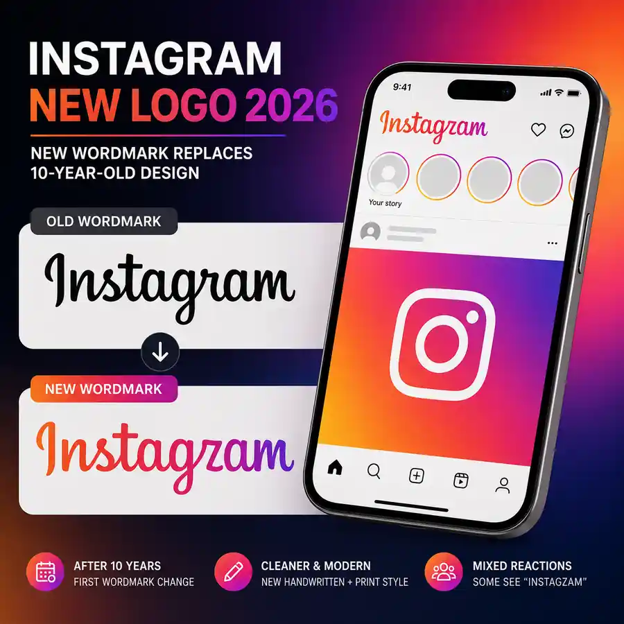

Instagram has introduced a new wordmark in its first major change to that part of the brand in 10 years. The August 13, 2026 update replaces the familiar cursive lettering seen at the top of the app with a design that mixes handwritten curves and more print-like forms, immediately prompting debate over how easy it is to read.
For people searching for the Instagram new logo 2026, the key point is that Instagram has changed its wordmark, not replaced the familiar pink, orange and purple gradient app icon. The update changes the stylized way the Instagram name is displayed rather than the core app symbol most users tap on their phones.
Why Instagram changed its wordmark after 10 years
Instagram head Adam Mosseri said the wordmark at the top of the app had not changed in a decade and that it was time for a refresh. In his official Instagram announcement, he described the new look as cleaner and more modern while retaining references to the original design, simplicity and craft associated with Instagram.
Mosseri also shared the redesign on Threads and invited people to offer their “hot takes,” suggesting Instagram expected a strong response. That reaction arrived quickly. Some commenters said the updated lettering appears to read “Instagzam” at first glance, while others said they preferred the character of the older cursive version.
The response has not been entirely negative. Some users have welcomed the cleaner styling, leaving the early reaction mixed rather than clearly for or against the redesign. The debate is mainly about familiarity and legibility: a wordmark that millions of people have seen for years can feel dramatically different even when the underlying product has not changed.
Old Instagram wordmark vs the 2026 design
The outgoing wordmark used more connected, flowing strokes and had a strongly handwritten appearance. The new version keeps some of that movement but introduces letters that look closer to conventional print. That hybrid treatment is what gives the redesign its more modern appearance, but it is also behind the “Instagzam” interpretation circulating in comments.
The change arrives while Instagram continues to evolve well beyond its original photo-feed identity. Reels, Stories, messaging and creator tools now occupy a much larger part of the app. Meta has also been experimenting with newer Instagram experiences, including changes around AI and image creation. A recent report on Meta removing an Instagram AI feature after privacy criticism shows how quickly the company is adjusting features when user concerns emerge.
The redesign also comes during a year of broader operational changes at Instagram. Adam Mosseri has been central to those decisions, including the company’s 2026 workplace policy changes outlined in this report on Instagram’s return-to-office push under Mosseri. Together, the moves show a platform continuing to reshape both its product and the organization behind it.
What the new Instagram logo means for users and creators
For everyday users, the immediate effect is visual. The wordmark update does not change how accounts, posts, Stories, Reels or direct messages work, and users do not need to alter their profiles because of the redesign.
Creators, publishers and businesses may notice the change more when preparing graphics or promotional material that uses Instagram branding. Over time, the new wordmark is likely to become the current visual reference, while older versions may continue appearing in existing assets.
The more interesting question is whether the readability criticism lasts. Familiarity can change perception quickly: lettering that looks unusual on launch day may feel normal after repeated exposure. But if users continue to see a different word before recognizing “Instagram,” the early joke could remain attached to the redesign.
Why this branding change matters
Instagram’s 2026 wordmark is a relatively small functional change, but it shows how sensitive established branding can be. The previous lettering had a decade to become familiar, so replacing it was always likely to attract attention. The new design tries to modernize Instagram without abandoning every trace of its handwritten identity, and the first public reaction shows how difficult that balance can be.
For now, the biggest story is not a change to Instagram’s features but a change to how its name looks. Whether users eventually embrace the cleaner wordmark or keep seeing “Instagzam” will become clearer only after the design has had time to settle into everyday use.

Make Swikblog your go-to source on Google for reliable updates, smart insights, and daily trends.