Spotify’s new disco ball logo has turned a birthday celebration into one of the most talked-about app redesigns of the week. The streaming platform replaced its familiar green icon with a glittering party-style version for its 20th anniversary, and the reaction has moved fast across Reddit, X, Threads and music fan communities.
Spotify app icons journey before and now share your opinion pic.twitter.com/c46KhNst87
— AhMad 𝕏 Ansari (@Ahmadansari2233) May 14, 2026
Ok so the new Spotify logo sucks pic.twitter.com/L82NQ98AMv
— Modern Country Music That Doesn’t Suck (@MCMTDoesntSuck) May 15, 2026
Hey, @Spotify, your new logo absolutely sucks. Bring back the old one. pic.twitter.com/wuo5oizGlp
— Majo 🍄 (@majogm) May 15, 2026
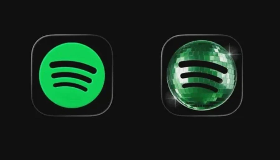
The temporary icon keeps Spotify’s classic black sound-wave mark but places it over a shiny green disco ball design. For some users, it feels playful and nostalgic. For others, it looks too loud, too busy and completely out of step with the clean app icon they have used for years.
The backlash grew quickly because Spotify’s logo is not just another app badge. It sits on millions of phone screens every day, often next to banking apps, social platforms, camera tools and messaging services. Any sudden visual change is immediately noticeable, especially when the new design is as bright and unusual as this one.
Spotify’s disco ball logo arrives with a bigger anniversary push
The logo change is part of Spotify’s wider 20th anniversary celebration. The company has launched Spotify 20: Your Party of the Year(s), a new personalized experience that looks back across a user’s full listening history rather than only the past 12 months.
The feature gives listeners a longer version of the Spotify Wrapped idea. It can show the first song a user streamed, their most-played artist of all time, the total number of unique songs they have listened to and an all-time playlist featuring their top 120 tracks. For longtime subscribers, that makes the anniversary update feel less like a standard promotion and more like a personal archive of music habits.
Swikblog has already covered the wider anniversary feature in detail here: Spotify 20 Rolls Out as Wrapped-Style Recap Covers Users’ Entire Streaming History.
That extra context matters because the disco ball icon is not a random redesign. It matches the campaign’s party theme, built around music nostalgia, personal listening data and the idea that every user has carried their own soundtrack through Spotify’s first two decades.
Users split between fun redesign and visual frustration
Online reaction has been sharply divided. Some users have praised the icon for being weird, temporary and more expressive than the polished corporate designs that dominate smartphone screens. Others have called it ugly, distracting and unnecessary.
The strongest criticism appears to come from users who treat their phone layout as a carefully arranged visual space. A sudden glittery icon can feel intrusive, especially for people who prefer minimalist home screens. That explains why some users said they moved Spotify away from their main app page until the classic logo returns.
At the same time, the controversy has helped Spotify dominate social conversation. A normal birthday campaign might have passed quietly outside music circles. A strange app icon, however, is instantly shareable. People do not need to open the feature or understand Spotify’s anniversary campaign to notice that the logo has changed.
That makes the backlash useful in one important way: it has made Spotify’s 20th anniversary visible to casual users who may otherwise have ignored the campaign. Even negative reactions have kept the topic trending and pushed more people to search for the meaning behind the disco ball design.
The logo may not stay for long
The biggest relief for frustrated users is that the disco ball logo appears to be temporary. Early reports from beta testers suggest Spotify may already be testing a return to the standard icon in newer iOS beta builds. That does not guarantee an immediate change for everyone, but it strongly suggests the disco ball look was never designed as a permanent replacement.
Spotify has rarely made major changes to its app icon. The company’s modern green circle design has been central to its identity since the mid-2010s, and that familiarity is part of why the disco ball version feels so dramatic. Even a short-term change can feel larger when a brand has kept its visual identity mostly stable for years.
The timing also works in Spotify’s favor. The logo appeared alongside a data-heavy anniversary feature, giving users two things to discuss at once: the design itself and their all-time listening stats. That combination makes the campaign feel closer to Wrapped season, when Spotify usually dominates social media with shareable cards and personal music data.
More than a logo debate
The reaction to Spotify’s new logo shows how emotionally attached users have become to everyday app design. A small square on a phone screen can carry years of habit, memory and brand recognition. Change it suddenly, even for a celebration, and people notice.
For Spotify, the disco ball icon has done exactly what a temporary anniversary stunt is supposed to do: it has made users talk. Some are laughing at it, some are defending it, and some are counting the days until the normal logo returns. Either way, the campaign has placed Spotify’s 20th anniversary in the center of the online conversation.
Whether the disco ball disappears within days or lasts a little longer, it has already become one of Spotify’s most visible design moments in years. The classic green logo will almost certainly remain the long-term identity, but this short-lived party icon has proved how quickly a tiny design change can turn into a viral moment.
Read More
- Visit Swikblog Homepage
- Maldives Diving Horror: Five Italians Die in Underwater Caves at Vaavu Atoll
- Sunday Times Rich List 2026: David Beckham Billionaire Sportsman
- Spaghetti House Closes All London Restaurants After 70 Years
- HSBC Halts $4 Billion Private Credit Investment After $400 Million Loss
- Australia Quarantines Cruise Ship Travellers After Hantavirus Outbreak
Make Swikblog your go-to source on Google for reliable updates, smart insights, and daily trends.